ion-item
Items are elements that can contain text, icons, avatars, images, inputs, and any other native or custom elements. Items should only be used as rows in a List with other items. Items can be swiped, deleted, reordered, edited, and more.
Basic Usage
Items left align text and wrap when the text is wider than the item. We can modify this behavior using the CSS Utilities provided by Ionic Framework, such as using .ion-text-nowrap in the below example. See the CSS Utilities Documentation for more classes that can be added to an item to transform the text.
Content Types
While items in a list take many forms, they typically support 5 different content types: supporting visuals, text, metadata, actions, and controls. However, not all of these content types should be used together at the same time. The following guide shows the different content types as well as how to properly utilize them in an application.
Supporting Visuals
Supporting visuals are decorative icons or other adornments for an item. Common examples of supporting visuals are Avatars, Icons, and Thumbnails. Since this content is not required to understand the intent of the item, it is typically hidden from screen readers using aria-hidden="true".
If a visual is required to interact with the item, such as an icon button, then the visual is an action not a supporting visual.
Supporting visuals should be rendered in a consistent manner. This makes the information in each item easier to parse.
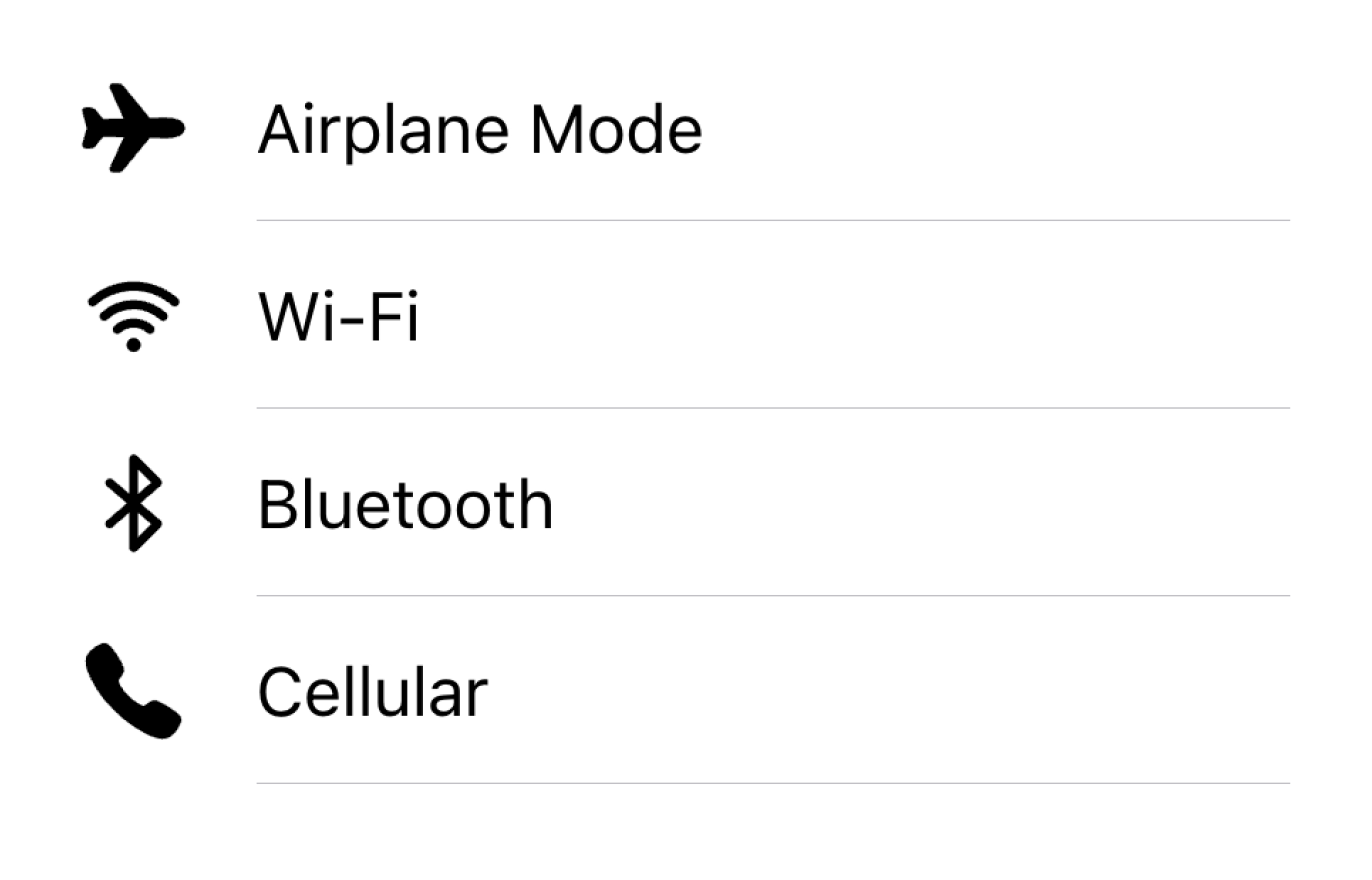
Align visuals on the same side in a list
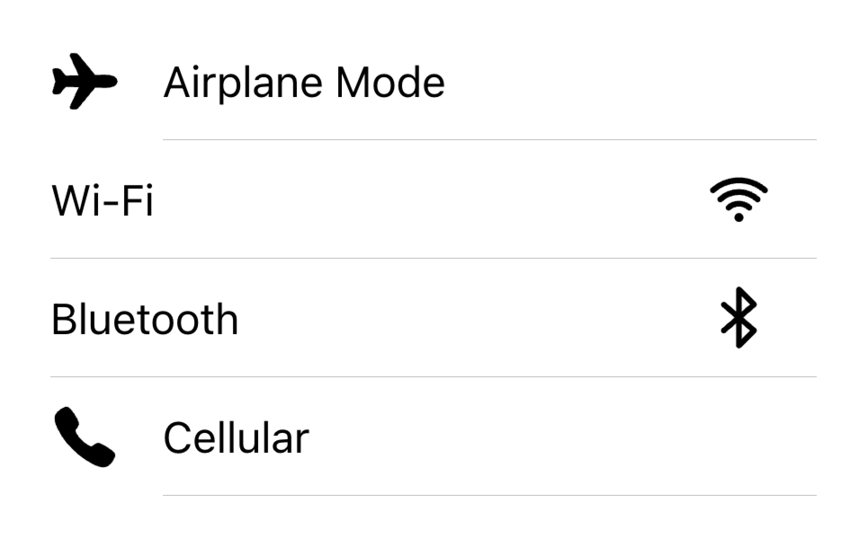
Don't render visuals with different alignments in the same list
In the example below, we are creating two lists with supporting visuals. The first list uses icons, and the second list uses avatars. The visuals are decorative, so they all have aria-hidden="true". Additionally, they are presented consistently in the start slot.
Text
The text content type includes form control labels or other visible text. This text serves to indicate the intent of the item. Try to keep the text short and to the point.
If you find that you need a few more sentences to clarify the item's purpose, consider moving the additional sentences to a Note at the bottom of the list. Adding the item to its own list makes it clear which item the text is associated with.
Move long text outside of the list
Don't try to fit long text in an item
In the example below, we are creating a list with different types of text. The "First Name" and "Last Name" labels serve to indicate what to type into the text inputs.
The "Allow Notifications" label on the toggle has additional text underneath it that notes users can disable notifications. Since this text is short, it is placed inside of the item.
Below that list is another list containing a textarea with a Note containing long text underneath. The textarea was placed in its own list to make it apparent that the long text is associated with the textarea and not any other fields.
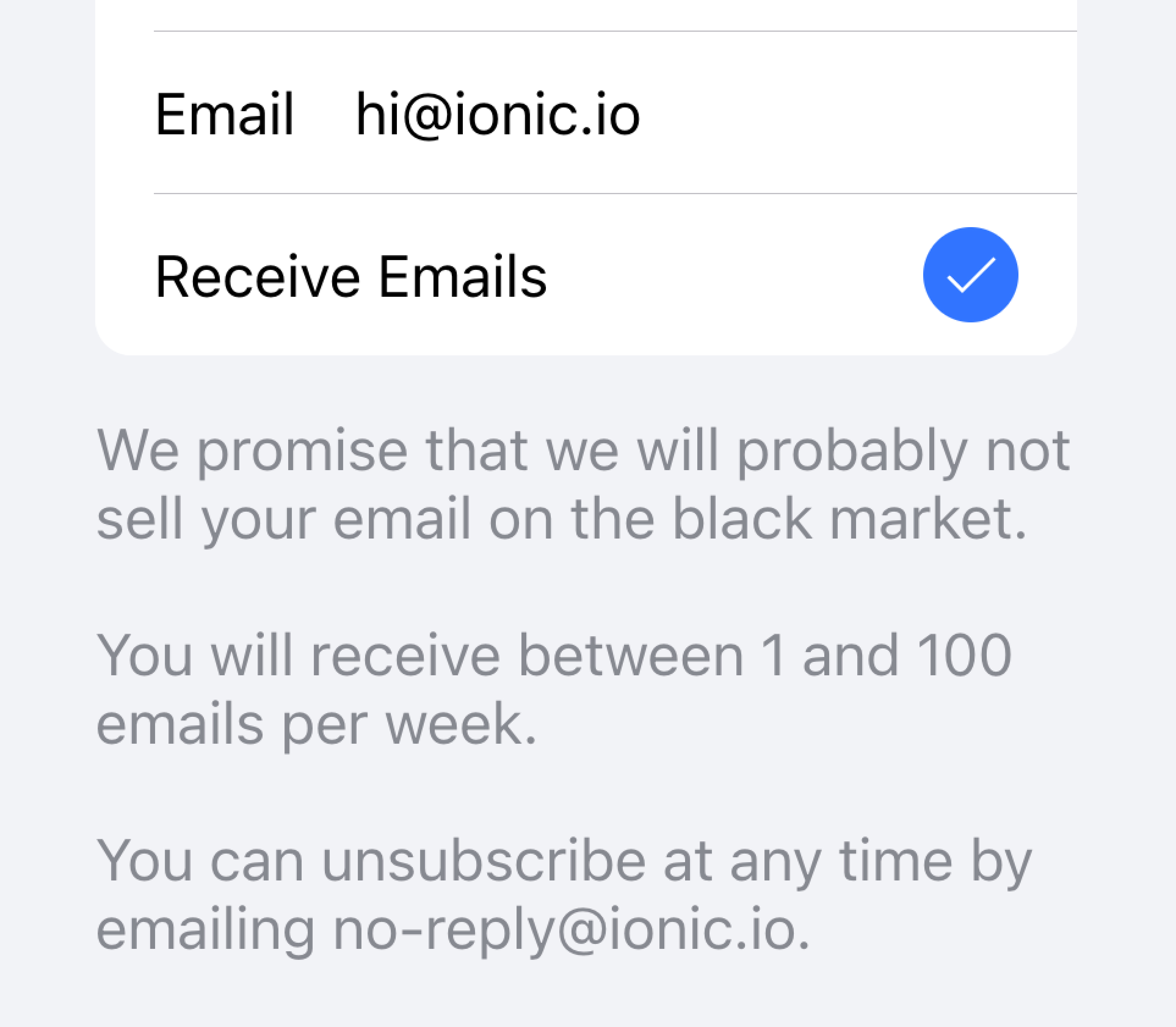
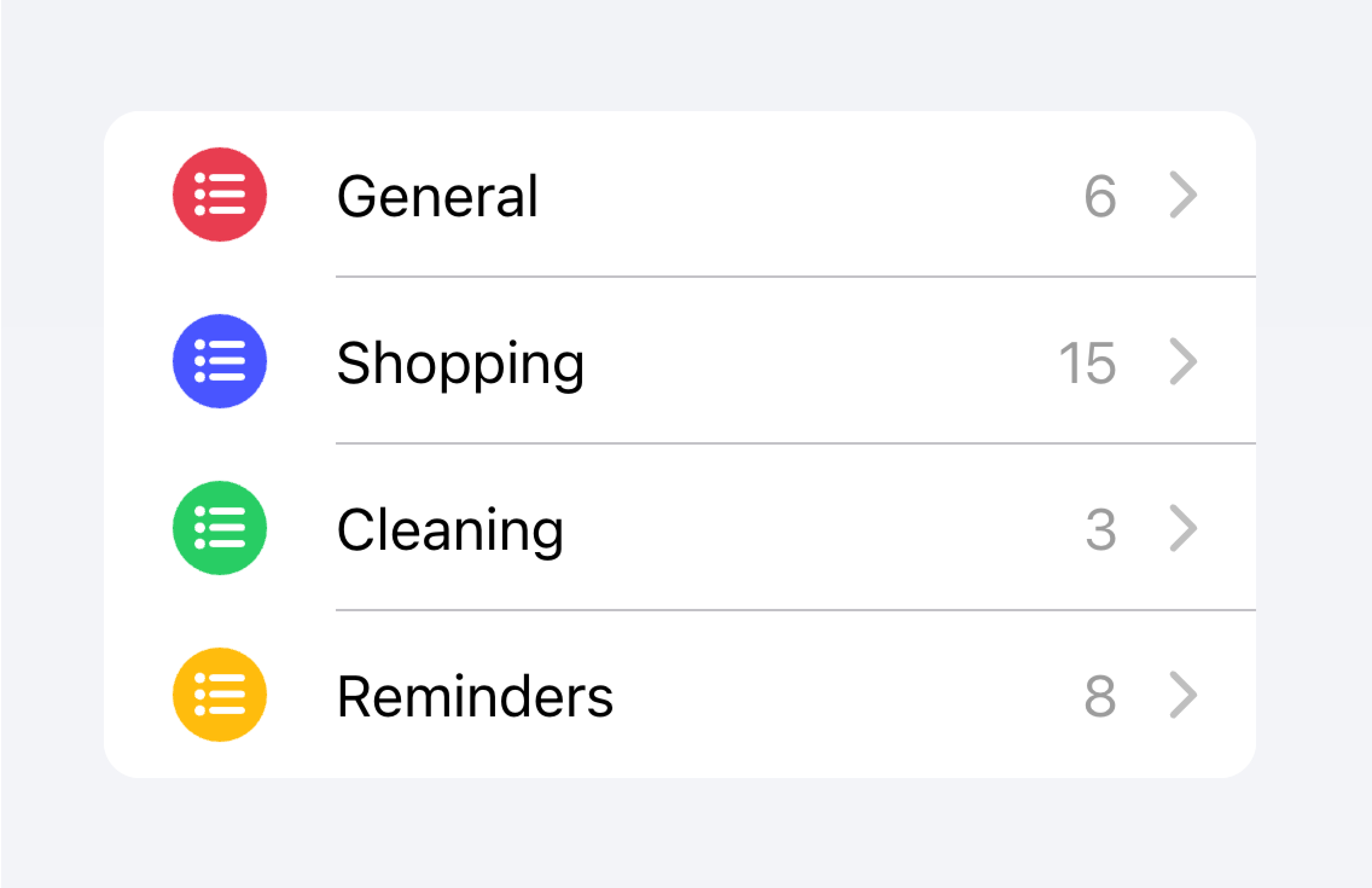
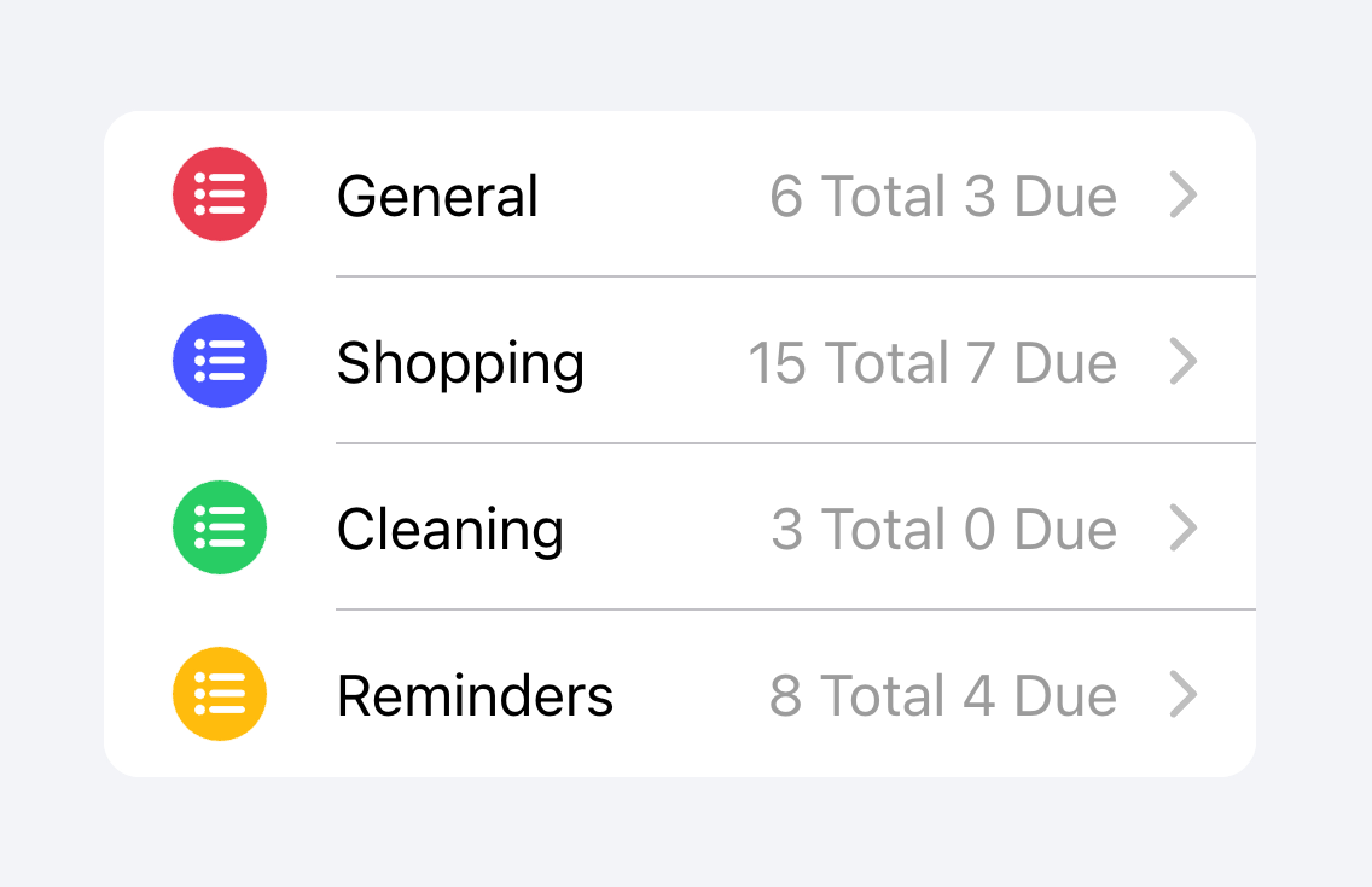
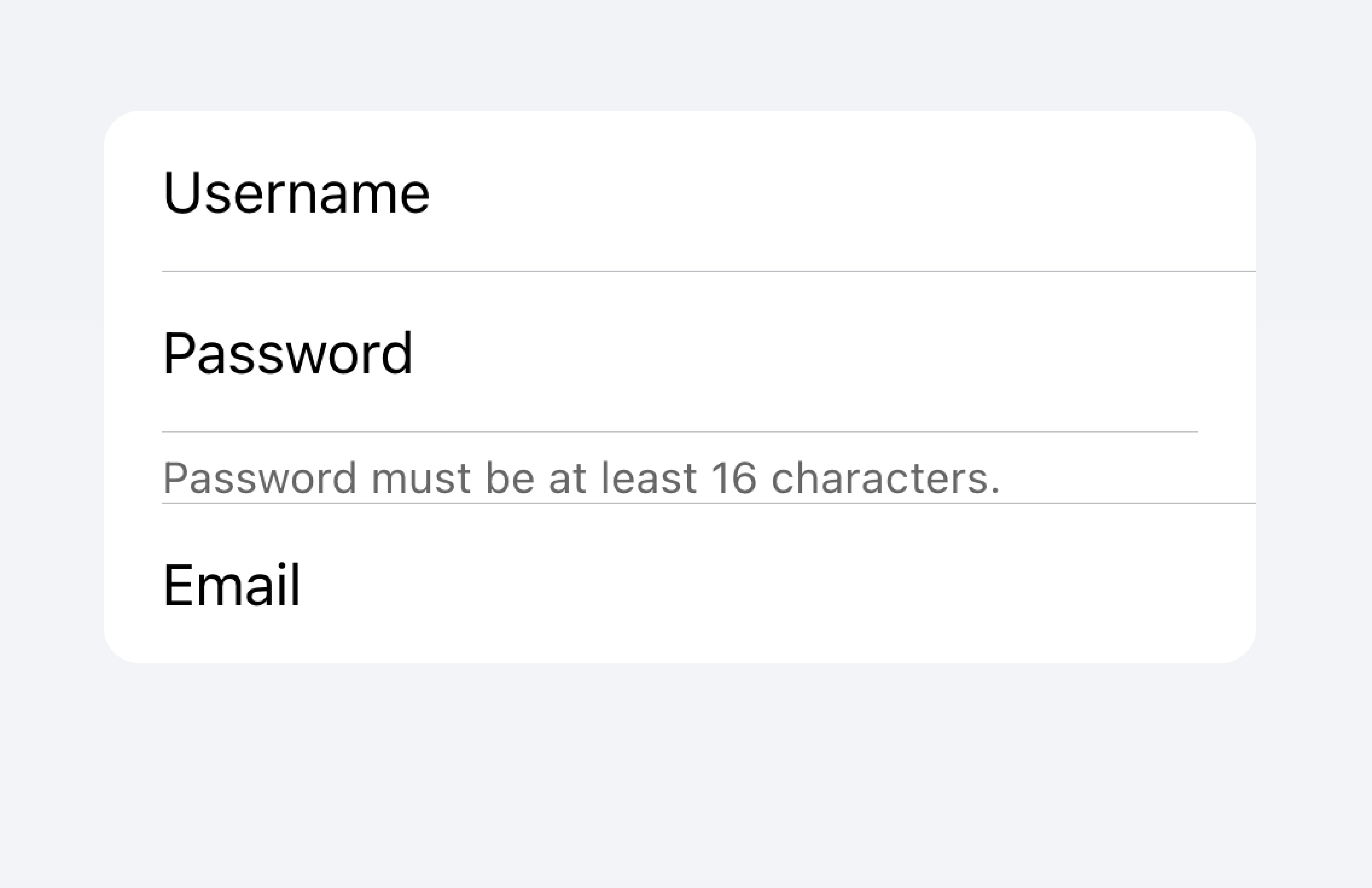
Metadata
Metadata provides additional context for an item such as status text or counts. Components like Badge or Note are great ways of showing metadata.
Limit the amount of metadata you include to only the most relevant information.
Add only the most important metadata
Don't add too much metadata as it can overwhelm or confuse the user.
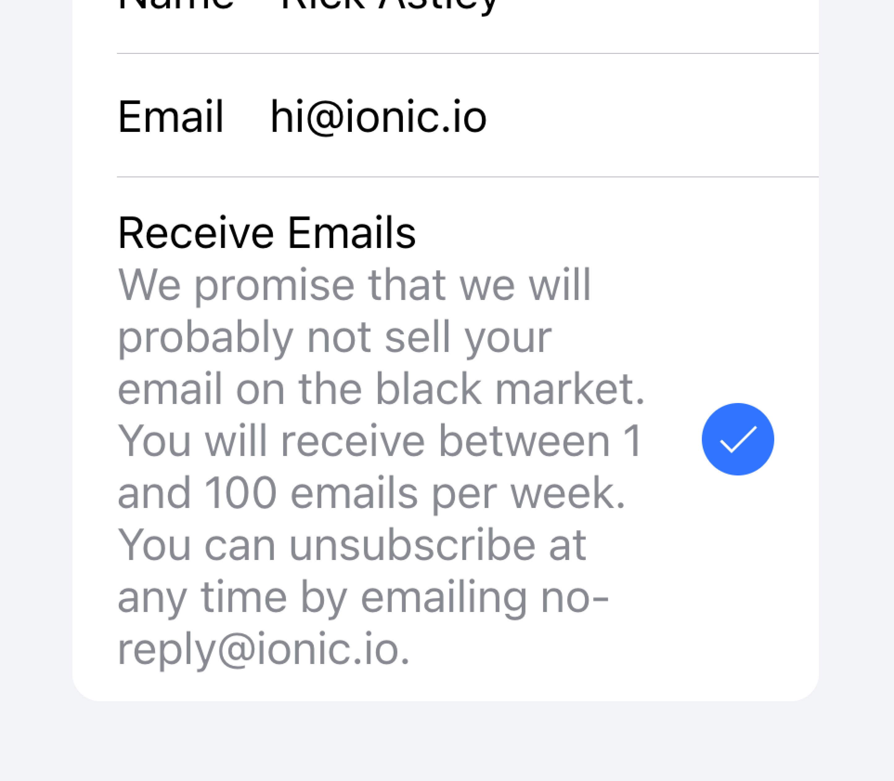
Developers should also consider how important the metadata is. Drawing attention to the metadata may be helpful for the user or it may distract them from the more important information depending on the use case.
Prioritize the most important content.
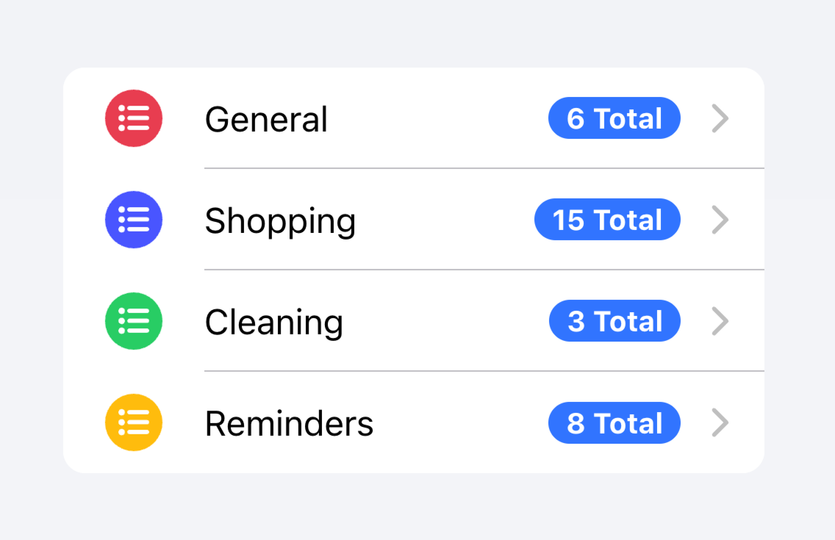
Prioritized metadata may distract from other important content.
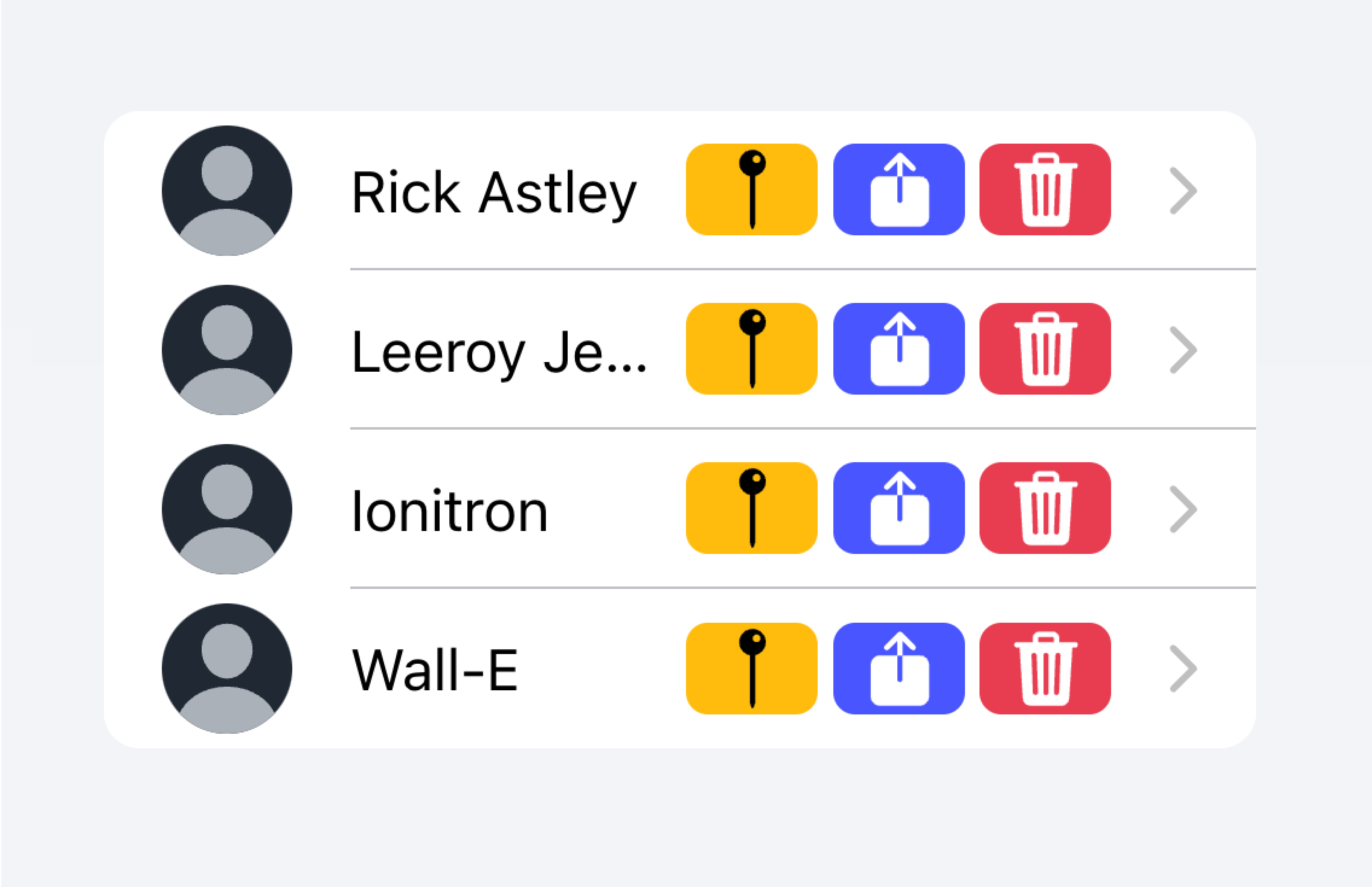
In the example below, we are creating two lists with different kinds of metadata. The first list uses Note to show how many tasks are in each to-do list.
The second list mimics the iOS Mail app to show an inbox. This list makes use of custom metadata including an "unread message" indicator in the "start" slot as well as a timestamp and custom detail icon in the "end" slot. The "unread message" indicator is highlighted in blue to draw the user's attention to the unread messages, while the timestamp is more subtle.
Actions
Actions are interactive elements that do something when you activate them. An item can have multiple actions displayed on a line. However, developers should ensure that each action's tap target is large enough to be usable.
Developers should avoid creating nested interactives which can break the user experience with screen readers. For example, developers should avoid adding a button inside the main content of the Item if the button property is set to true.
Actions can be added by using the Item Sliding component. Actions can also be placed directly inside of the Item without the use of Item Sliding, but this should be limited to no more than 2 actions.
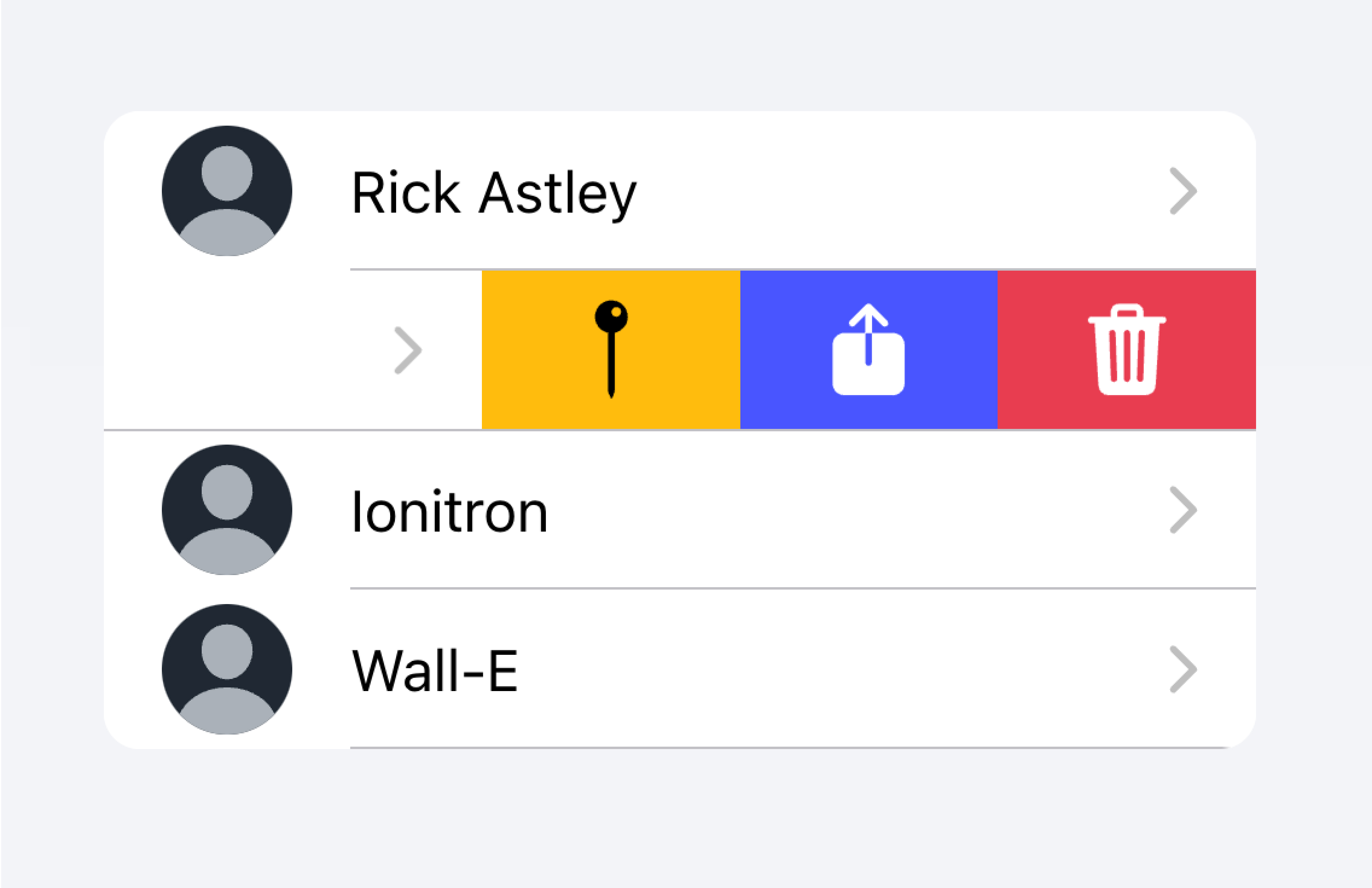
Use an Item Sliding to reveal multiple actions by swiping on the Item.
Don't put more than 2 actions within an Item.
In the example below, we are creating a list of contacts. Each item is a stubbed button intended to bring you to the full contact page for that item. There are additional actions associated with each item that users can reveal by swiping on the item.
Controls
Controls are form components such as checkboxes, inputs, radios, and more. Each item in a list should have at most two controls due to screen space constraints.
Metadata such as helper text or character counts should not be used on form controls in list views. If such metadata is needed, the form control should be placed outside of a list. Filled Inputs are a great way of visually defining the input container outside of a list.
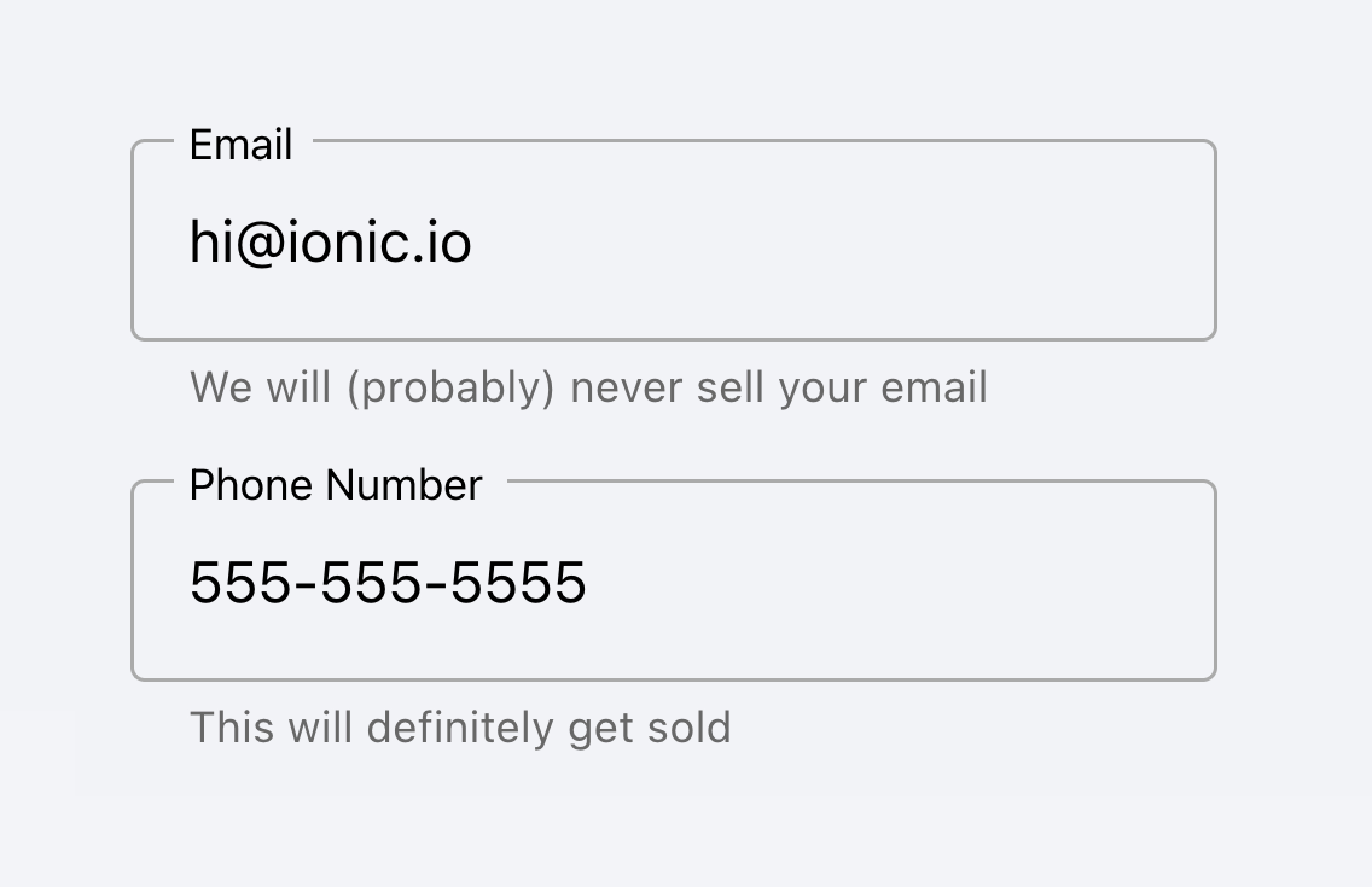
Place inputs with metadata outside of the list.
Don't put metadata for inputs in the list.
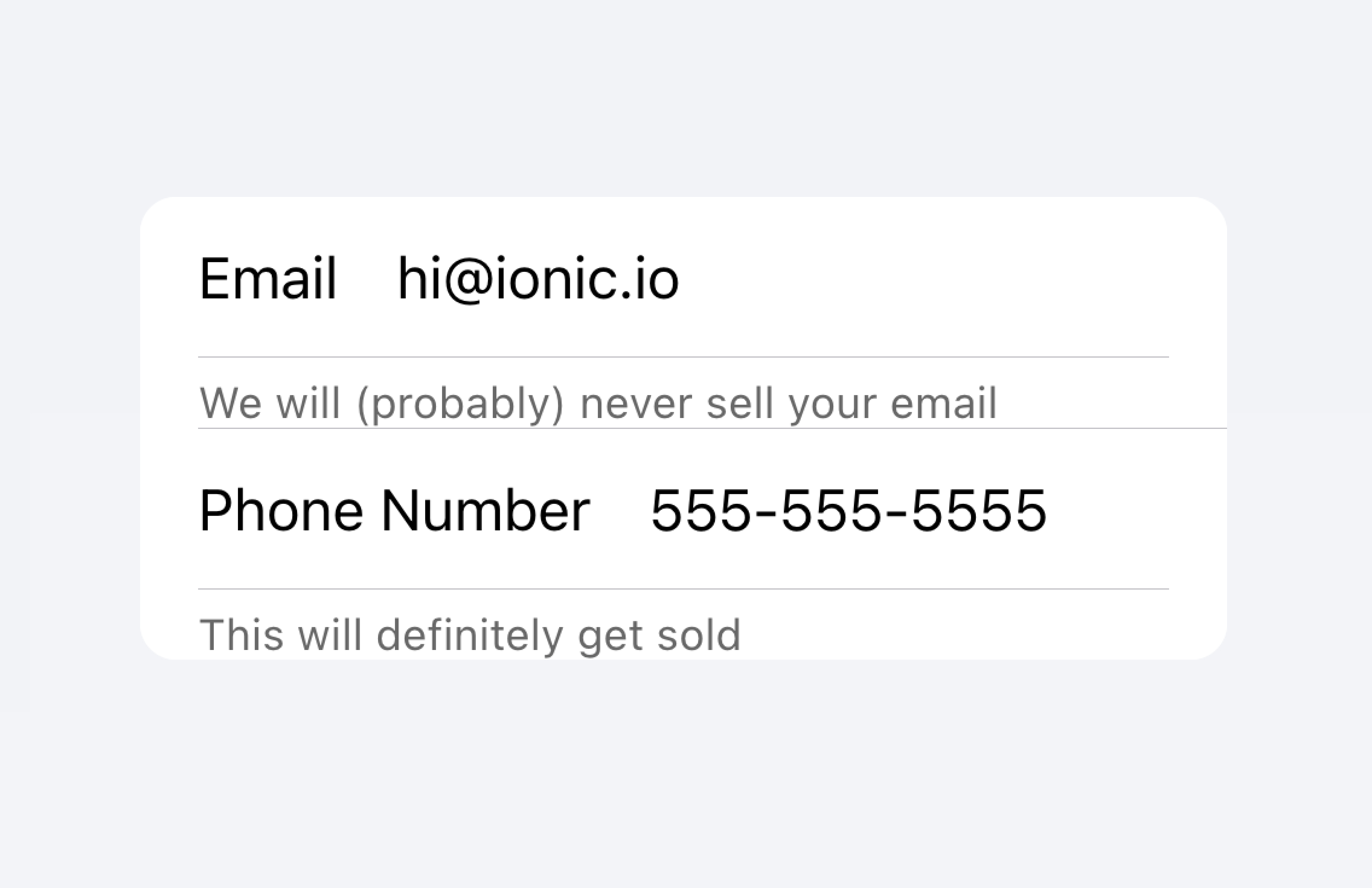
Alternatively, the metadata can be placed in a Note at the bottom of the list.
Place metadata for inputs at the end of a list.
Don't put metadata for inputs in the list.
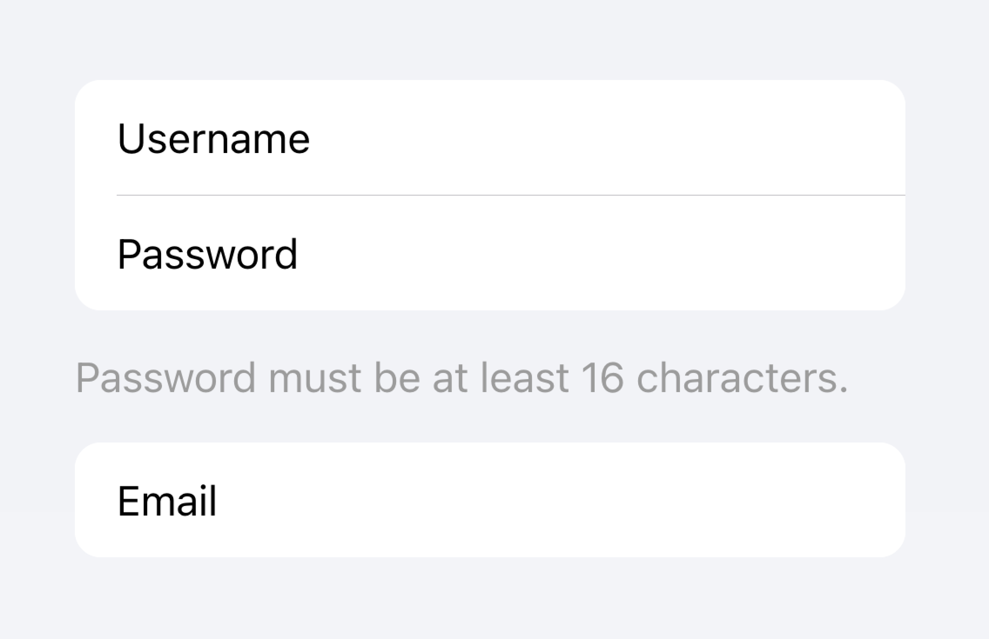
Items should typically have no more than two controls. If you need more controls, consider adding the additional controls in a Modal that is accessible from the item.
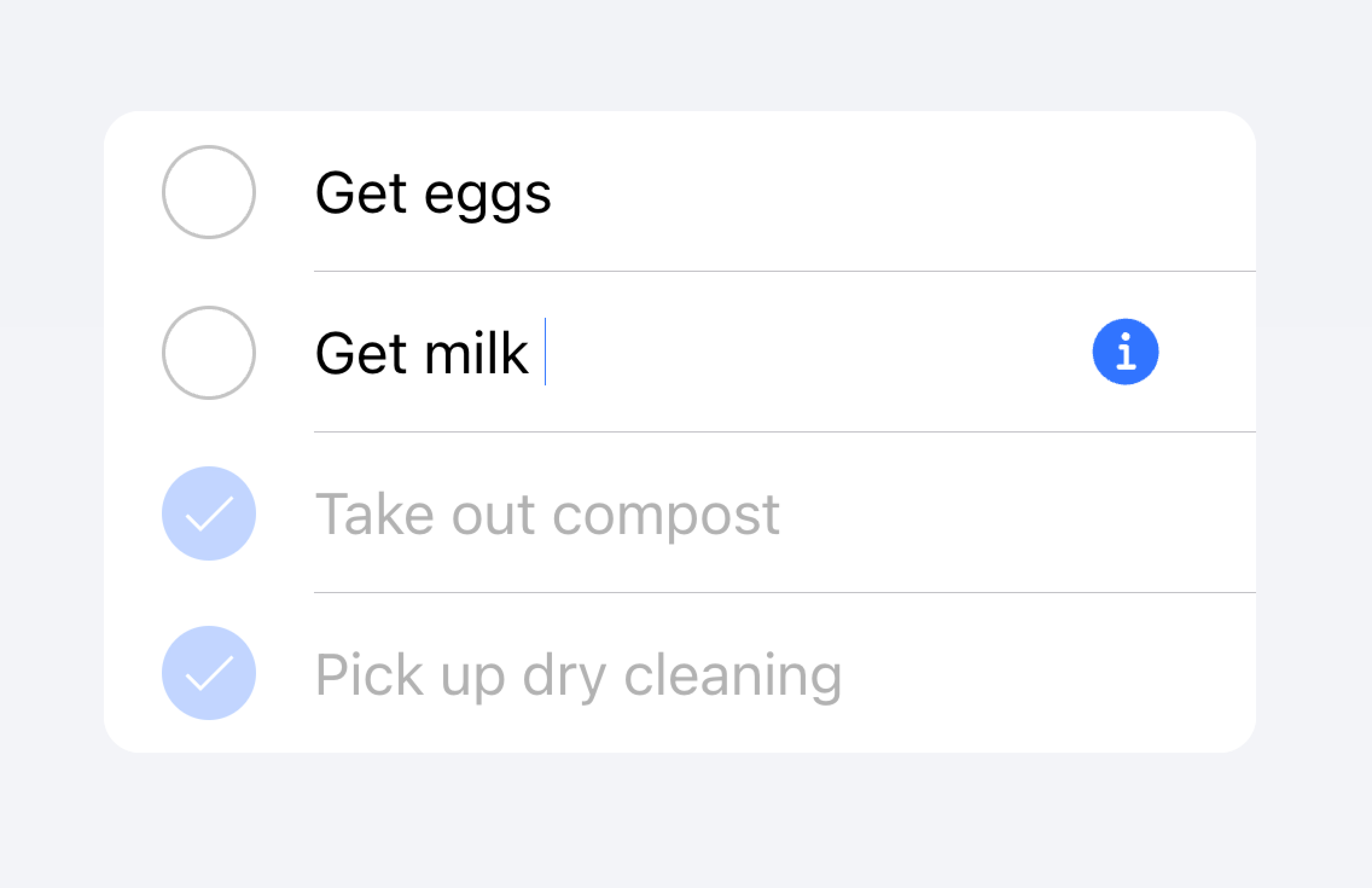
Move additional controls to a submenu accessible from the item.
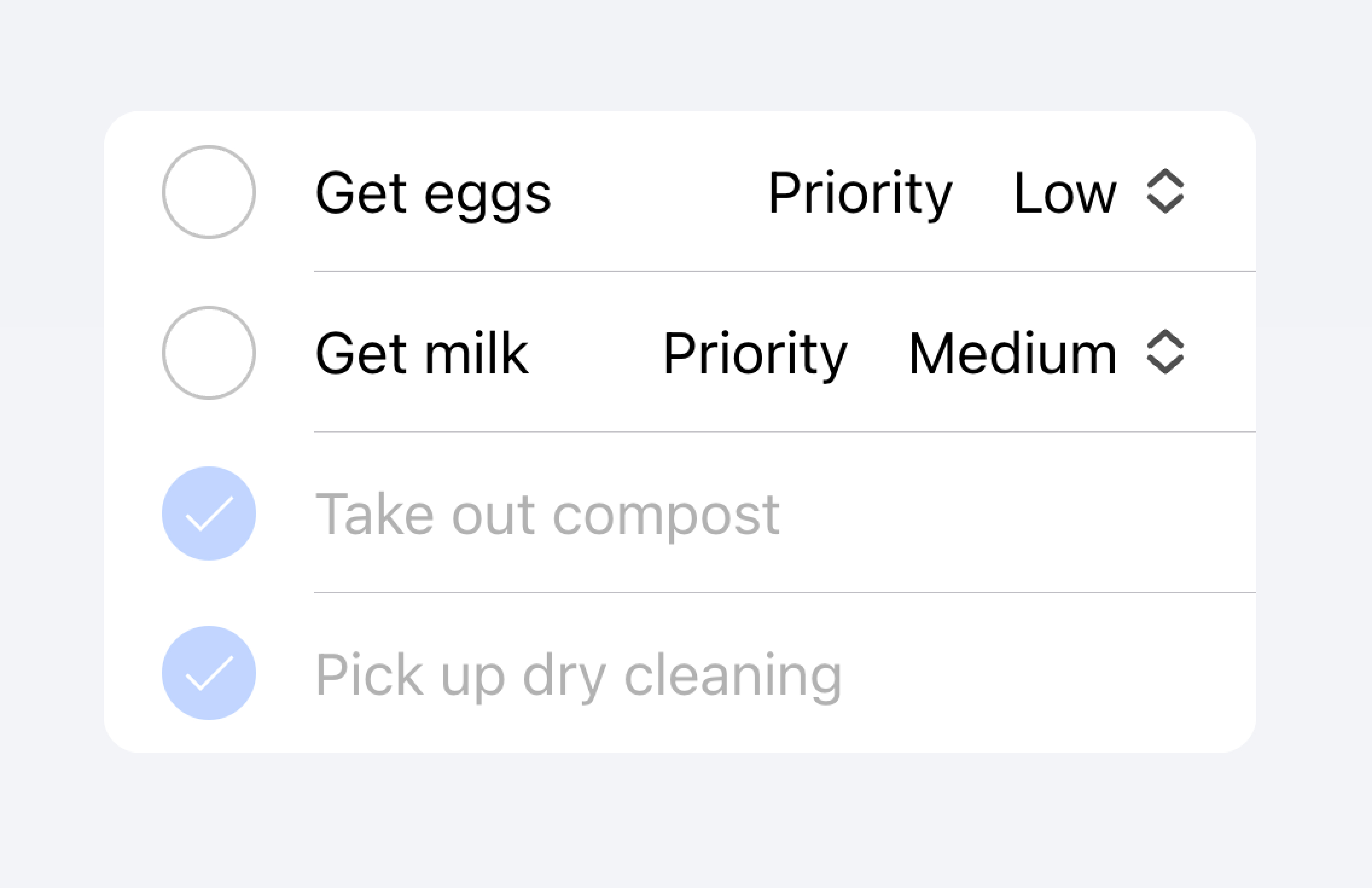
Don't use more than two controls within an item.
In the example below, we are creating a list of to-do tasks. Each item has a checkbox and an input. The checkbox lets the user mark a task as complete, and the input lets the user change the name of the task.
Clickable Items
An item is considered "clickable" if it has an href or button property set. Clickable items have a few visual differences that indicate they can be interacted with. For example, a clickable item receives the ripple effect upon activation in md mode, has a highlight when activated in ios mode, and has a detail arrow by default in ios mode.
Detail Arrows
By default clickable items will display a right arrow icon on ios mode. To hide the right arrow icon on clickable elements, set the detail property to false. To show the right arrow icon on an item that doesn't display it naturally, set the detail property to true.
Item Lines
Items show an inset bottom border by default. The border has padding on the left and does not appear under any content that is slotted in the "start" slot. The lines property can be modified to "full" or "none" which will show a full width border or no border, respectively.
Buttons in Items
Buttons are styled smaller inside of items than when they are outside of them. To make the button size match buttons outside of an item, set the size attribute to "default".
Item Inputs
Theming
Colors
CSS Shadow Parts
CSS Custom Properties
Guidelines
The following guidelines will help ensure your list items are easy to understand and use.
- Items should only be used inside of Lists.
- Items inside of a list should be presented in a consistent format. For example, if your items present decorative icons, the icons should be positioned in the same way between items.
- Items should never render nested interactives. Screen readers are unable to select the correct interactive element when nested interactives are used. For example, avoid placing a button inside of an
ion-itemthat hasbutton="true". - Use content types correctly. The Item component is designed to be a row in a List and should not be used as a general purpose container.
Accessibility
Keyboard Interactions
An <ion-item> has the following keyboard interactions when any of these conditions are met:
- The
buttonproperty is set to"true", rendering a native<button>element. - The
hrefproperty is set, rendering a native<a>element. - The
routerLinkproperty is set, rendering a native<a>element.
| Key | Description |
|---|---|
| Tab | Moves focus to the next focusable element. |
| Shift + Tab | Moves focus to the previous focusable element. |
Button
When an <ion-item> renders a native <button> element, the keyboard interactions follow the same pattern as the button role:
| Key | Description |
|---|---|
| Enter | Activates the item, triggering its click event. If the item is within a form and has type set to "submit", it submits the form. |
| Space | Activates the item, triggering its click event. Does not submit the form, even if the item type is "submit". |
Anchor
When an <ion-item> renders a native <a> element, the keyboard interactions follow the same pattern as the link role:
| Key | Description |
|---|---|
| Enter | Activates the item, navigating to the linked page or moving focus to the in-page target. |
Properties
button
| Description | trueの場合、ボタンタグがレンダリングされ、アイテムはタップ可能になる。 |
| Attribute | button |
| Type | boolean |
| Default | false |
color
| Description | アプリケーションのカラーパレットから使用する色を指定します。デフォルトのオプションは以下の通りです。 "primary", "secondary", "tertiary", "success", "warning", "danger", "light", "medium", と "dark" です.色に関する詳しい情報は theming を参照してください。 |
| Attribute | color |
| Type | "danger" | "dark" | "light" | "medium" | "primary" | "secondary" | "success" | "tertiary" | "warning" | string | undefined |
| Default | undefined |
detail
| Description | trueの場合、アイテムに詳細矢印が表示されます。デフォルトは false で、mode が ios で href または button プロパティが存在する場合のみです。 |
| Attribute | detail |
| Type | boolean | undefined |
| Default | undefined |
detailIcon
| Description | detail が true に設定されているときに使用するアイコンです。 |
| Attribute | detail-icon |
| Type | string |
| Default | chevronForward |
disabled
| Description | trueの場合、ユーザはそのアイテムと対話することができません。 |
| Attribute | disabled |
| Type | boolean |
| Default | false |
download
| Description | この属性は、ブラウザが URL に移動する代わりに URL をダウンロードするように指示し、ユーザはローカルファイルとして保存するように促されます。この属性に値がある場合、保存のプロンプトであらかじめ入力されたファイル名として使用されます(ユーザーはファイル名を変更することができます)。 |
| Attribute | download |
| Type | string | undefined |
| Default | undefined |
href
| Description | ハイパーリンクが指し示す URL または URL フラグメントを格納します。このプロパティが設定されている場合、アンカータグがレンダリングされます。 |
| Attribute | href |
| Type | string | undefined |
| Default | undefined |
lines
| Description | アイテムに表示される下枠の表示方法。 |
| Attribute | lines |
| Type | "full" | "inset" | "none" | undefined |
| Default | undefined |
mode
| Description | modeは、どのプラットフォームのスタイルを使用するかを決定します。 This is a virtual property that is set once during initialization and will not update if you change its value after the initial render. |
| Attribute | mode |
| Type | "ios" | "md" |
| Default | undefined |
rel
| Description | ターゲットオブジェクトとリンクオブジェクトの関係を指定します。値は、スペースで区切られたリンクタイプのリストです。 |
| Attribute | rel |
| Type | string | undefined |
| Default | undefined |
routerAnimation
| Description | ルータを使用する場合、hrefを使用して別のページに移動する際の遷移アニメーションを指定します。 |
| Attribute | router-animation |
| Type | ((baseEl: any, opts?: any) => Animation) | undefined |
| Default | undefined |
routerDirection
| Description | ルータを使用する場�合、hrefを使用して他のページに移動する際の遷移方向を指定します。 |
| Attribute | router-direction |
| Type | "back" | "forward" | "root" |
| Default | 'forward' |
target
| Description | リンク先のURLを表示する場所を指定します。hrefを指定した場合のみ適用される。特別なキーワードがあります。"_blank", "_self", "_parent", "_top". |
| Attribute | target |
| Type | string | undefined |
| Default | undefined |
type
| Description | ボタンの種類。onclickまたはbutton`プロパティが存在する場合にのみ使用される。 |
| Attribute | type |
| Type | "button" | "reset" | "submit" |
| Default | 'button' |
Events
No events available for this component.
Methods
No public methods available for this component.
CSS Shadow Parts
| Name | Description |
|---|---|
detail-icon | アイテムのシェブロンアイコンを表示します。detail="true"`のときのみ適用されます。 |
native | すべての子要素をラップするネイティブHTMLのボタン、アンカー、またはdiv要素です。 |
CSS Custom Properties
- iOS
- MD
| Name | Description |
|---|---|
--background | アイテムの背景 |
--background-activated | 押されたときのアイテムの背景。注意:これを設定すると、Material Designの波紋に干渉します。 |
--background-activated-opacity | 押されたときのアイテム背景の不透明度 |
--background-focused | タブキーでフォーカスしたときのアイテムの背景 |
--background-focused-opacity | タブキーでフォーカスしたときのアイテムの背景の不透明度 |
--background-hover | ホバー時のアイテムの背景 |
--background-hover-opacity | ホバー時のアイテムの背景の不透明度 |
--border-color | アイテムの縁取りの色 |
--border-radius | アイテムの境界線の半径 |
--border-style | アイテムの枠のスタイル |
--border-width | アイテムの枠の幅 |
--color | アイテムのカラー |
--color-activated | 押したときのアイテムの色 |
--color-focused | タブキーでフォーカスしたときのアイテムの色 |
--color-hover | ホバー時のアイテムの色 |
--detail-icon-color | アイテム詳細アイコンの色 |
--detail-icon-font-size | アイテム詳細アイコンのFont Size |
--detail-icon-opacity | アイテム詳細アイコンの不透明度 |
--inner-border-width | アイテム内枠の幅 |
--inner-box-shadow | アイテム内側のボックスシャドウ |
--inner-padding-bottom | アイテム内側のBottom Padding |
--inner-padding-end | 方向が左から右の場合はRight Padding、方向がアイテムの内側の右から左の場合はLeft Paddingとなります。 |
--inner-padding-start | 方向が左から右の場合はLeft Padding、方向が右から左の場合はRight Paddingがアイテム内側に入る |
--inner-padding-top | アイテム内側のTop Padding |
--min-height | アイテムの最小高さ |
--padding-bottom | アイテムのBottom Padding |
--padding-end | 方向が左から右の場合はRight Padding、方向が右から左の場合はLeft Paddingで項目を囲む |
--padding-start | 方向が左から右の場合はLeft Padding、方向が右から左の場合はRight Paddingで項目を囲む |
--padding-top | アイテムのTop Padding |
--ripple-color | アイテム波及効果の色 |
--transition | アイテムの変遷 |
| Name | Description |
|---|---|
--background | アイテムの背景 |
--background-activated | 押されたときのアイテムの背景。注意:これを設定すると、Material Designの波紋に干渉します。 |
--background-activated-opacity | 押されたときのアイテム背景の不透明度 |
--background-focused | タブキーでフォーカスしたときのアイテムの背景 |
--background-focused-opacity | タブキーでフ�ォーカスしたときのアイテムの背景の不透明度 |
--background-hover | ホバー時のアイテムの背景 |
--background-hover-opacity | ホバー時のアイテムの背景の不透明度 |
--border-color | アイテムの縁取りの色 |
--border-radius | アイテムの境界線の半径 |
--border-style | アイテムの枠のスタイル |
--border-width | アイテムの枠の幅 |
--color | アイテムのカラー |
--color-activated | 押したときのアイテムの色 |
--color-focused | タブキーでフォーカスしたときのアイテムの色 |
--color-hover | ホバー時のアイテムの色 |
--detail-icon-color | アイテム詳細アイコンの色 |
--detail-icon-font-size | アイテム詳細アイコンのFont Size |
--detail-icon-opacity | アイテム詳細アイコンの不透明度 |
--inner-border-width | アイテム内枠の幅 |
--inner-box-shadow | アイテム内側のボックスシャドウ |
--inner-padding-bottom | アイテム内側のBottom Padding |
--inner-padding-end | 方向が左から右の場合はRight Padding、方向がアイテムの内側の右から左の場合はLeft Paddingとなります。 |
--inner-padding-start | 方向が左から右の場合はLeft Padding、方向が右から左の場合はRight Paddingがアイテム内側に入る |
--inner-padding-top | アイテム内側のTop Padding |
--min-height | アイテムの最小高さ |
--padding-bottom | アイテムのBottom Padding |
--padding-end | 方向が左から右の場合はRight Padding、方向が右から左の場合はLeft Paddingで項目を囲む |
--padding-start | 方向が左から右の場合はLeft Padding、方向が右から左の場合はRight Paddingで項目を囲む |
--padding-top | アイテムのTop Padding |
--ripple-color | アイテム波及効果の色 |
--transition | アイテムの変遷 |
Slots
| Name | Description |
|---|---|
| `` | slotがない状態で提供される場合、コンテンツは名前付きslotの間に配置されます。 |
end | コンテンツは、LTRではアイテムテキストの右側に、RTLでは左側に配置されます。 |
start | コンテンツは、LTRではアイテムテキストの左側に、RTLでは右側に配置されます。 |